How to visualize data on a map using Python

Certifications:

In this article with his help jupyter notebook and her python we will make one heatmap. We will do a full analysis using dataframe, polynomial regression scatter plot, bar plot.
Let's start by loading the libraries we'll need:
import folium  #είναι για την δημιουργία χάρτη
import json
import numpy as np  #easy maths calculations
import pandas as pd    #για τα dataframe
import matplotlib      #για τα γραφήματα
import matplotlib.pyplot as plt

geo_Data = 'https://raw.githubusercontent.com/python-visualization/folium/master/examples/data/world-countries.json'
But what is the json we put in the geo_Data variable?
It is essentially a file with associated countries with their coordinates that is needed in the folium to make the margins of the map.
In the next step we will load a csv with data I found for Europe and they make us for example:
dfun = pd.read_csv('https://gist.githubusercontent.com/str4t3gos/d089dd9bab5d075a4c39e48da301b374/raw/653feea057e6b7aa54ee772922e696e7f7d1ba61/country_un2.csv')
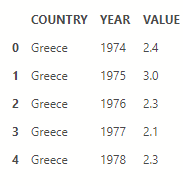
After we have loaded into a variable that has taken the properties of the panda dataframe as csv with the command .head() show us our data:
dfun.head()
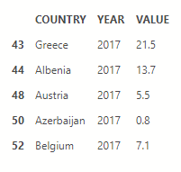
We can filter the data of the dataframe, for example bring only the data of 2017:
dfun17 = dfun[dfun['YEAR'] == 2017]

dfun17.head()
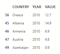
Let's fill another variable with the 2010 data, we'll need it later:
dfun10 = dfun[dfun['YEAR'] == 2010]

dfun10.head()
We set the map properties from folium to a variable and put the colors to it along with the rest of the arguments via the choropleth property.
*Let me remind you that legend is the box that explains what the different colors we see mean. Also with the .save property we have the possibility to save it as html.
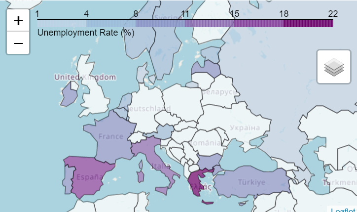
Create a map
sf_map= folium.Map([40., 10.], zoom_start=4)

sf_map.choropleth(

    geo_data=geo_Data,

    name='choropleth',

    data=dfun17,

    columns=['COUNTRY','VALUE'],

    fill_color='BuPu',

    fill_opacity=0.7,

    line_opacity=0.5,

    key_on='feature.properties.name',

    legend_name='Unemployment Rate (%)'

)

folium.LayerControl().add_to(sf_map)

sf_map

#sf_map.save('europe17.html')
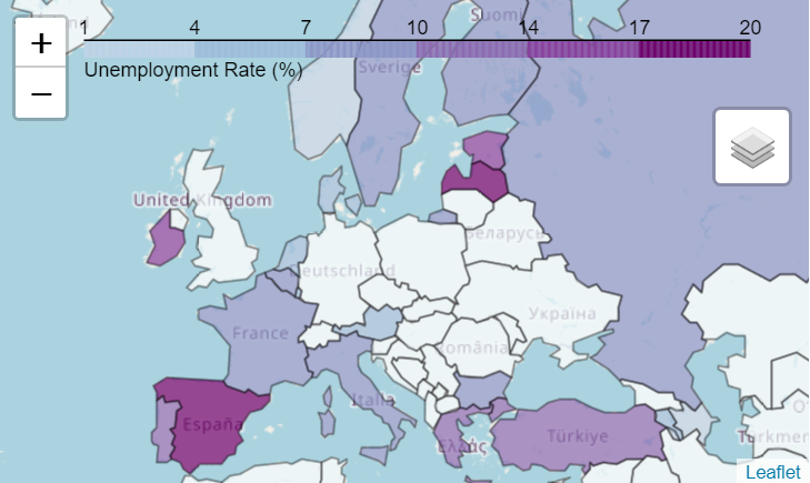
Let's see the difference with 2010 when we made the other dataframe:
sf_map10= folium.Map([40., 10.], zoom_start=4)

sf_map10.choropleth(

    geo_data=geo_Data,

    name='choropleth',

    data=dfun10,

    columns=['COUNTRY','VALUE'],

    fill_color='BuPu',

    fill_opacity=0.7,

    line_opacity=0.5,

    key_on='feature.properties.name',

    legend_name='Unemployment Rate (%)'

)

folium.LayerControl().add_to(sf_map10)

sf_map10
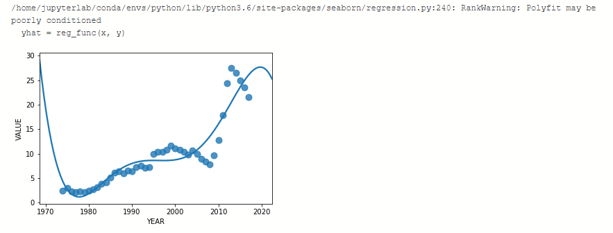
Create a polynomial regression graph
Let's make a polynomial regression graph with the data of each year of Greece.
We will need a new dataframe filtered only with Greece and to import the seaborn library:
dgreece = dfun[dfun['COUNTRY'] == 'Greece']

dgreecefinal = dgreece[['YEAR','VALUE']]

import seaborn as sns

ax = sns.regplot(x="YEAR", y="VALUE", data=dgreecefinal,

                 scatter_kws={"s": 80},

                 order=6, ci=None)
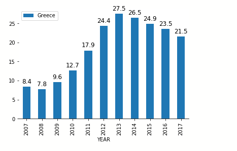
Create a bar plot graph
Let's go to the last example.
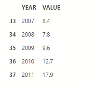
We will make a barplot graph with the data of Greece from 2007 onwards:
dgreecefinal10years = dgreecefinal[dgreecefinal['YEAR'] >=2007]

dgreecefinal10years.head()
We will use the matplotlib library by setting its parameter and with the .show property it makes the display:
%matplotlib inline

ax=dgreecefinal10years.plot.bar('YEAR','VALUE')

ax.spines['left'].set_visible(False)

ax.spines['top'].set_visible(False)

ax.spines['right'].set_visible(False)

for p in ax.patches:

    ax.annotate(np.round(p.get_height(),decimals=2),

                (p.get_x()+p.get_width()/2., p.get_height()),

                ha='center',

                va='center',

                xytext=(0, 10),

                textcoords='offset points',

                fontsize = 12

               )

ax.legend(['Greece'],loc='upper left')

plt.show()