How to make charts in Microsoft Excel using Python

Certifications:

In the Microsoft Excel beyond the use of functions and pivoting we have the possibility to add graphs based on this data.
But we know that we can also make graphs using Python with libraries like matplotlib and seaborn.
In this article we will review how to combine data from different Excels into one dataframe with data pivoting. Our goal is to have the data in a form that we could draw a useful conclusion using a graph.
The example
We have an Excel file with the total sales named sales.xlsx:

There is a second Excel file with the customer names called pelates.xlsx:

We would like to have the names of the customers in the sales.xlsx file, let's see how this is done.
In addition to having Python installed, we will need the following libraries, which are easily installed by running the following commands at the command prompt:
pip install xlrd
pip install pandas
pip install numpy
pip install openpyxl
pip install matplotlib
pip install seaborn
We import the libraries:
import pandas as pd
import numpy as np
import matplotlib.pyplot as plt
import seaborn as sns
We fill 2 variables dataframe with the records of each Excel. With the sheet_name parameter we can also choose the gender in which the data is located:
df_pelates = pd.read_excel('pelates.xlsx',sheet_name='Sheet1′)

df_sales = pd.read_excel('sales.xlsx',sheet_name='Sheet1′)
We should rename the id field to customer_id so that it has the same name as it has in the sales dataframe:
df_pelates.rename(columns={'id':'customer_id'}, inplace=True)
In this step the vlookup.
We merge both dataframes into a new one (df_final) in the customer_id field. In the how parameter we declare the way it will be done join.
As in SQL we have left, right, outer, inner options. Declaring the choice right we declare that we want all the records from the second dataframe by linking to those linked to the first. If there is no common customer_id it will have the value NaN/Null or else the blank:
df_final = pd.merge(df_pelates, df_sales, on='customer_id', how='right')
To see the fields the merged dataframe now has:
print(df_final.columns)

If we want to see the result so far:
print(df_final)
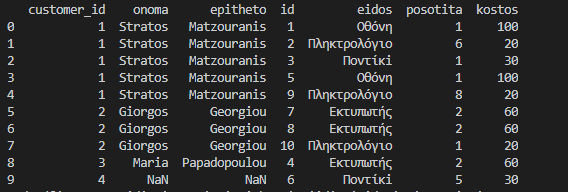
Now let's calculate the actual cost spent with each purchase by multiplying the quantity by the cost:
df_final['kostos_agoras'] = df_final['posotita']*df_final['kostos']
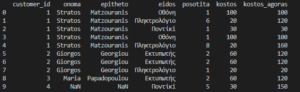
We do a group by per customer to find the total amount for each:
df_final_pelatis = df_final.groupby(['customer_id','epitheto','onoma'],as_index=False).sum()
df_final_pelatis = df_final_pelatis[['onoma','epitheto','kostos_agoras']]
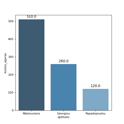
At this point we are calling from the library seaborn the barplot with one line of code. (the code of for it is not necessary unless we want to display in each bar the exact amount as in the example):
plt.figure(figsize=(6, 6))

ax = sns.barplot(x="epitheto",y="kostos_agoras", data=df_final_pelatis, palette='Blues_d')

for p in ax.patches:
    ax.annotate(np.round(p.get_height(),decimals=2),
                (p.get_x()+p.get_width()/2., p.get_height()),
                ha='center',
                va='center',
                xytext=(0, 10),
                textcoords='offset points',
                fontsize = 12
               )

#ax.legend(loc='top')
plt.savefig('plot1.png', dpi = 80)
plt.show()
The bar chart is saved as plot1.png.
The function plt.show() will show us the chart on the screen as well:
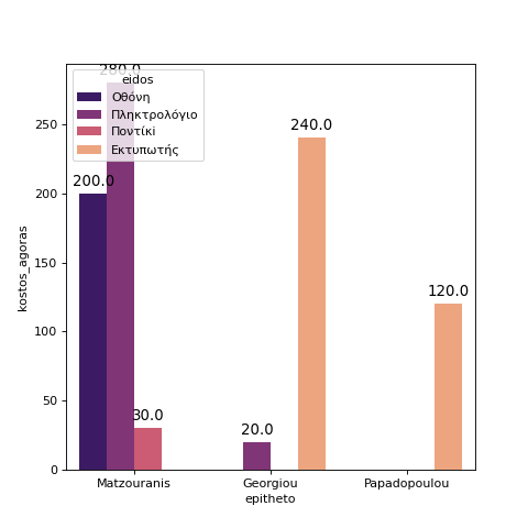
We can do and subcategory barplot
Its use will allow us on the x-axis, which contains the last name of each customer, to separate the data according to the type of products:
Let's look at the example.
df_final_eidos = df_final.groupby(['customer_id','epitheto','onoma','eidos'],as_index=False).sum()

df_final_eidos = df_final_eidos[['epitheto','onoma','eidos','kostos_agoras']]
Calling again seaborn barplot we will add the field hue as a subcategory and we will put the new dataframe(df_final_eidos) in place of data. We will also use other palette colors:
plt.figure(figsize=(6, 6))

ax = sns.barplot(x="epitheto", hue="eidos",y="kostos_agoras", data=df_final_eidos, palette='magma')

for p in ax.patches:
    ax.annotate(np.round(p.get_height(),decimals=2),
                (p.get_x()+p.get_width()/2., p.get_height()),
                ha='center',
                va='center',
                xytext=(0, 10),
                textcoords='offset points',
                fontsize = 12
               )

#ax.legend(loc='top')
plt.savefig('plot2.png', dpi = 80)
plt.show()
It will be saved as plot2.png.
Here is the result:
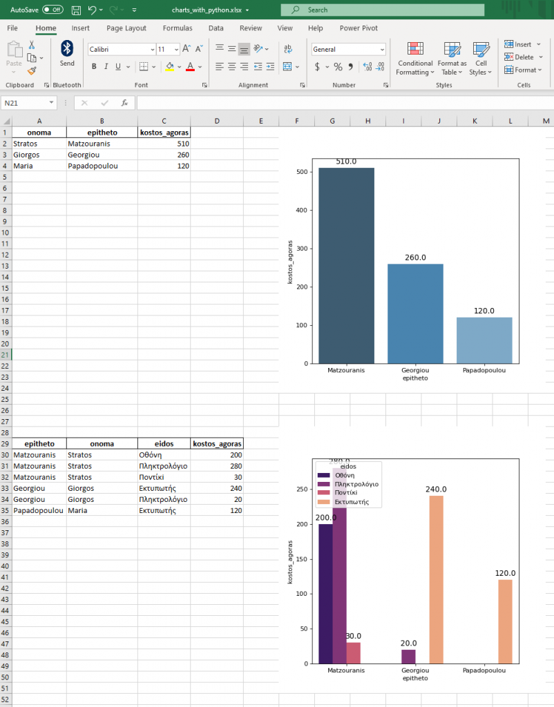
To save both dataframes and bar charts in the same excel
We save the dataframes/tables first in the rows/columns we want. (we could put a loop and when it ends the next one starts):
writer = pd.ExcelWriter('charts_with_python.xlsx', engine='openpyxl')
df_final_pelatis.to_excel(writer, index=False,startcol=0,startrow=0)
df_final_eidos.to_excel(writer, index=False,startcol=0,startrow=28)

writer.save()
In order to save the bar plots in Excel, we will have to load it again.
By command openpyxl.drawing.image.Image we will define the 2 images we made before and with the anchor command we will set in which cell each image should be placed:
wb = openpyxl.load_workbook('charts_with_python.xlsx')
ws = wb.worksheets[0]
img = openpyxl.drawing.image.Image('plot1.png')
img.anchor = 'F1'
ws.add_image(img)
img2= openpyxl.drawing.image.Image('plot2.png')
img2.anchor = 'F28'
ws.add_image(img2)

wb.save('charts_with_python.xlsx')
The final result in the generated Excel file